Case study on identity and website design for Pello Basecamp, the accommodation and activities center in Finnish Lapland.
Our team extensively researched Finland's Hospitality and Fishing sectors to find out how people experience nature and relax. The Pello Basecamp website has been developed to accommodate the needs of this target group of revelers. Pello Basecamp is a resort, activity, and accommodation facility in Finnish Lapland.
Project
We created a new brand identity, website design, and custom illustrations for Fishing Accommodation in Finnish Lapland.
This project's creative team from the Hotsnow side included Igor Polyakov, Sabit Sugirov, and Edward Njuguna.
Client
Pello Basecamp is a newly set boutique accommodation in Finland. The business offers perfect and comfortable lodging for lovers of salmon fishing.Set along the banks of the Tornio River, Pello Basecamp offers quality accommodation in the city of Pello. The Tornio River is Europe's largest free-flowing salmon river, known for its large salmon. The city of Pello has been declared the fishing capital of Finland - from salmon fishing, boating, Lapland's nature, and Pello's services come together in Pello Basecamp's vicinity.
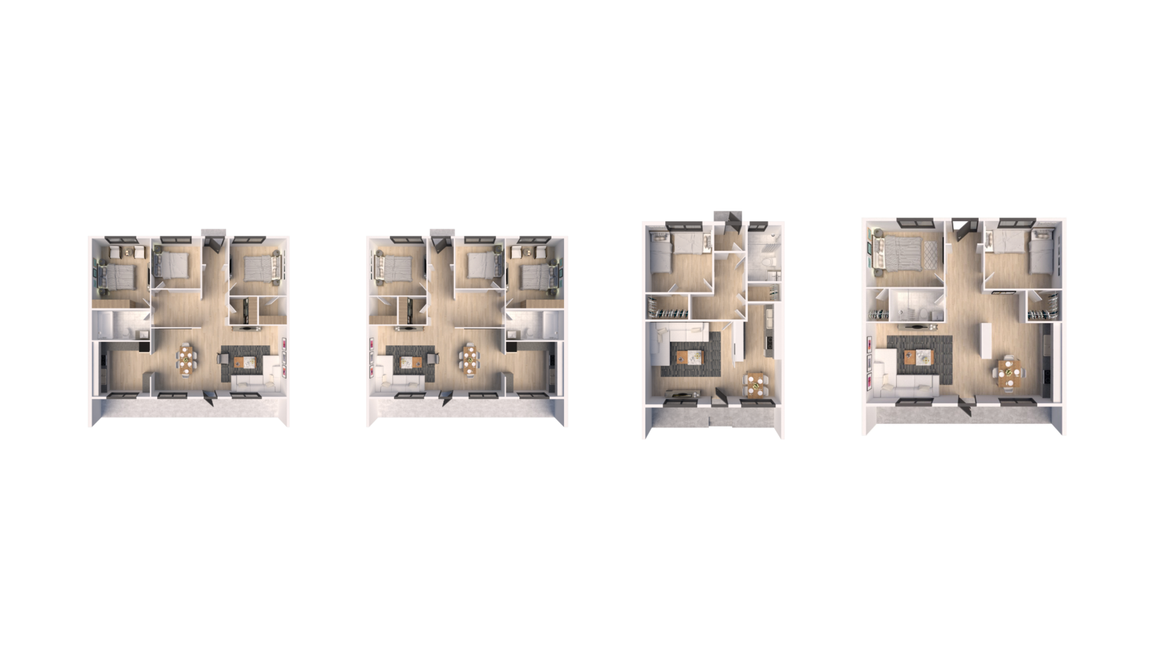
A successful catch from Tornio River, Finland's largest salmon river, flowing next to Pello Basecamp, is almost guaranteed. Basecamp offers 1-3 bedrooms + kitchen accommodation in well-equipped apartments, all with a kitchen equipped with a fridge. Sauna facilities come as extras and a laundry room is also available.
The season at Pello Basecamp is not limited to summer; in winter, the environment is ideal for snowmobiling. This accommodation is suitable for the whole family or friends; the setting and scenery of Pello offer a wide range of holiday experiences.
For fishing enthusiasts, Lapland offers clean and catch-proof waters. Rental boats and guide services are conveniently available through their partners.
We labored on the brand identity and website for this establishment. The booking system and website were designed to be accessible and affordable, so we created a branding strategy that was clear and easy to use. This approach helped them to connect with their customers and elucidate the advantages of their products.
Identity Design
Branding began with extensive research into the Hospitality and Fishing industries in Finland, the difficulties faced by prospective consumers, and the points where the brand's communication was being made. The branding had to emphasize the service's critical advantages: adventure, comfort, and modernity.Furthermore, the team wanted to produce a visual language where the identity could range from businesslike to emotional. Color is one of the primary tools used to establish a strong emotional connection to the Hospitality industry through the psychology of color and its relation to the topic of hospitality, summer, Lapland, fishing, and outdoor activities. The green, orange, and blue colors are bright and vibrant, creating an instant visual connection to the topic. Blue is also a traditionally Nordic color associated with nature.
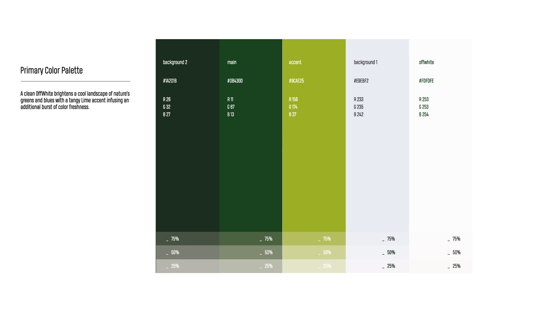
Color is one of the core tools supporting emotionality and adventure in brand design for Pello Basecamp. The palette consists of shining distinction tints of natural dyes: green, orange, and bright blue.
The latter is also traditionally associated with nordic countries and nature. We used the psychology of color to give an instant visual connection to the topic of hospitality, summer, Lapland, camp, and fishing.

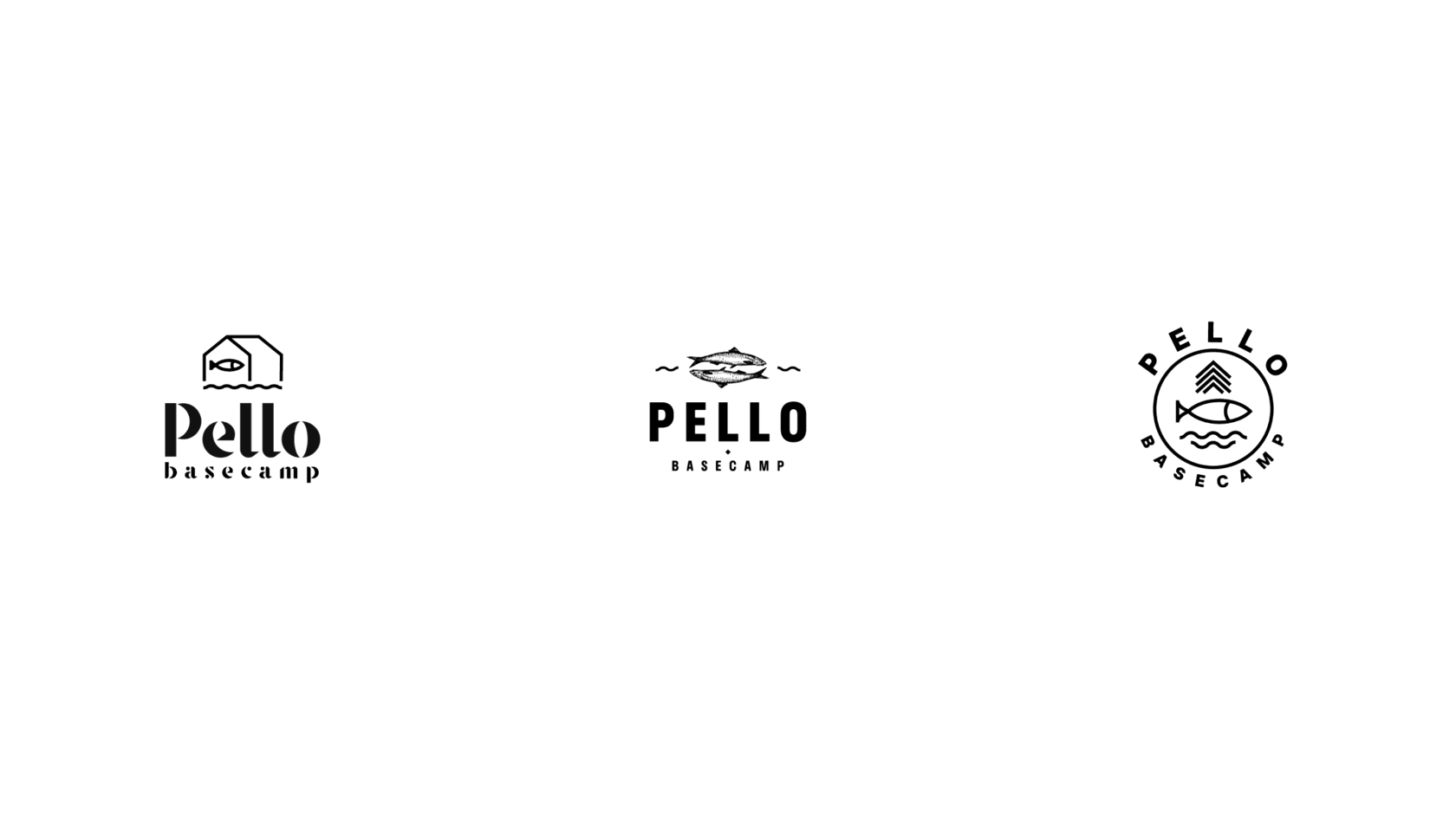
Having decided upon colors, the team began working on the logo. The initial strategy approach was established on the fish as a central symbol of the place and company. The creative investigation founded on that resulted in a batch of brand symbol choices recalling that idea via linear illustration showing the salmon, snowmobile trail marking sign, and spruce tree. The basic form chosen for the brand symbol was a circle.
Here's a peek at the logo design approach, from sketches via take-ups to the shiny symbol. The first version of the emblem formed in this directive was an abstract round sign consisting of the jumping salmon fish.
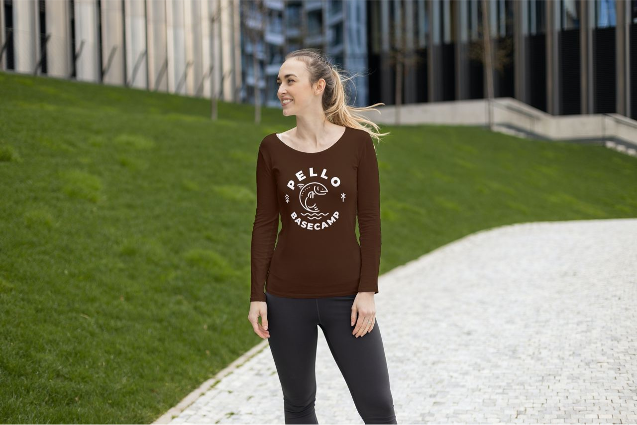
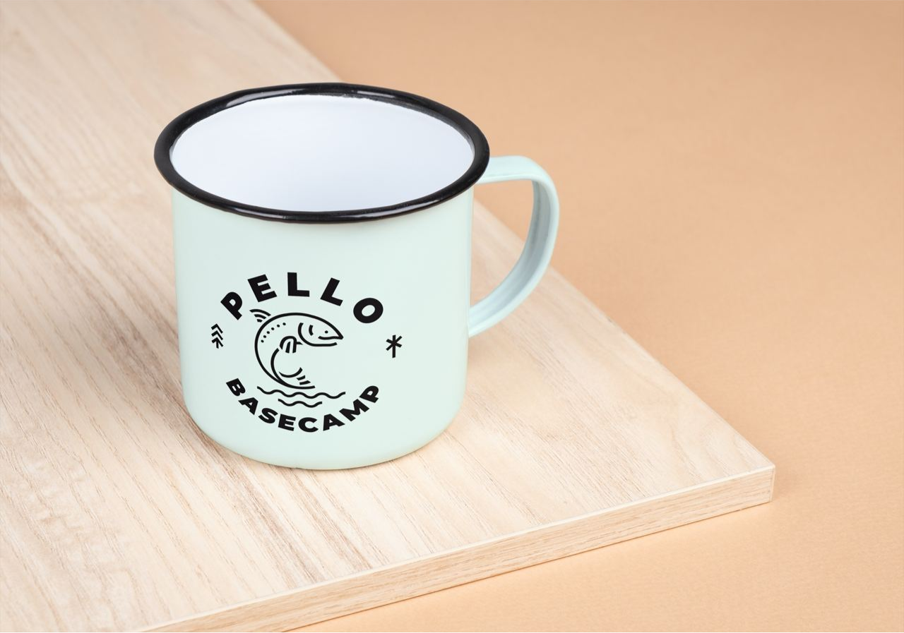
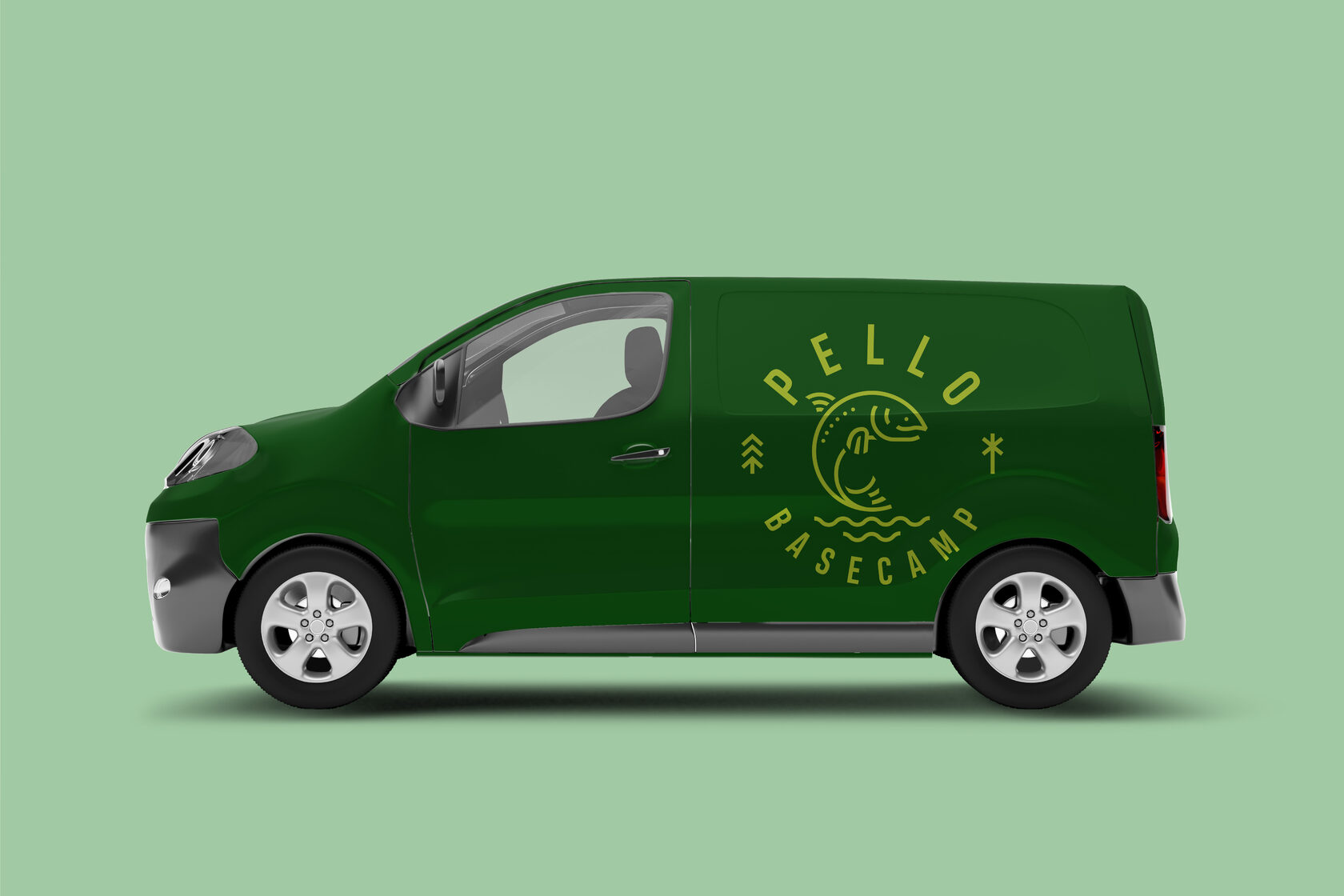
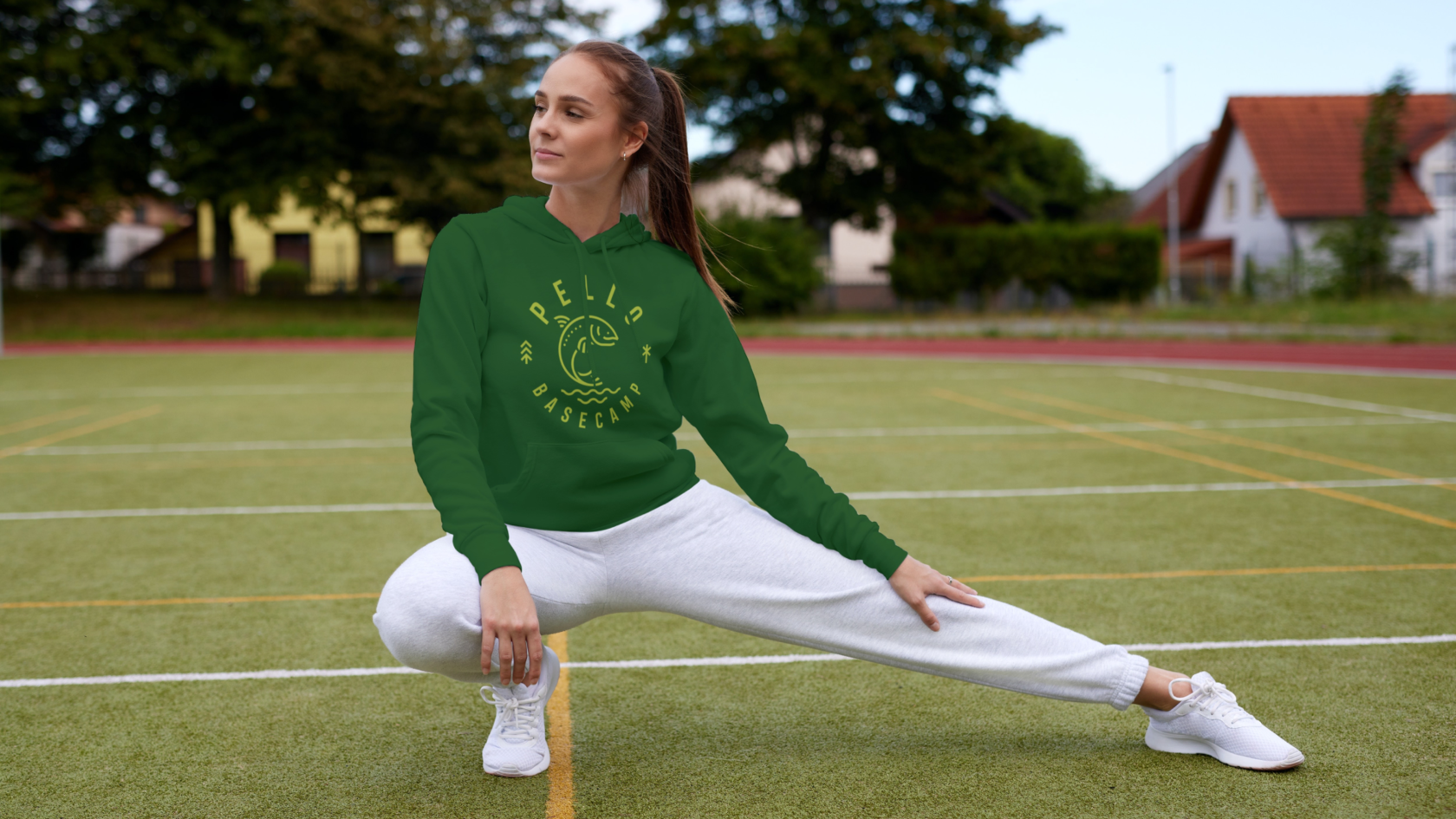
Our designers also presented the set of branded items to demonstrate how this interpretation of the symbol and color palette could perform for different marketing purposes: social media posting, business cards, banners, printed advertisements, etc.
Although the prevailing idea was valid, we determined to push to another iteration, as this interpretation of the symbol could bring up associations with some competitors.
However, the further our designers dived into the visual universe for the Pello Basecamp brand, the more the client's team got confident that they would like to modify the logo. The salmon fish symbol makes its design bright, up-to-date, recognizable, and flexible for various communication objectives.
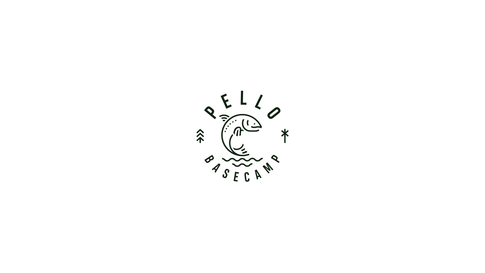
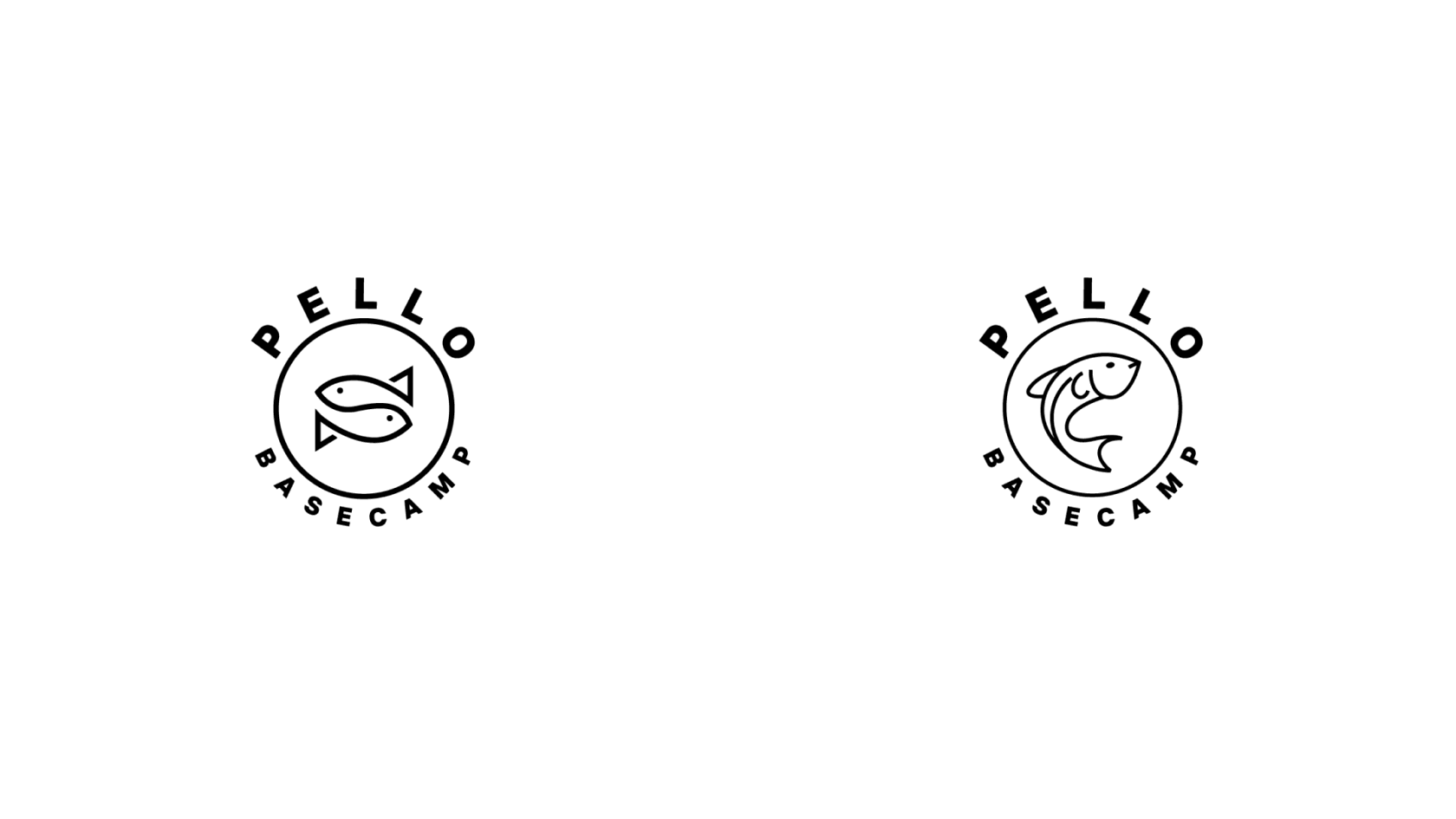
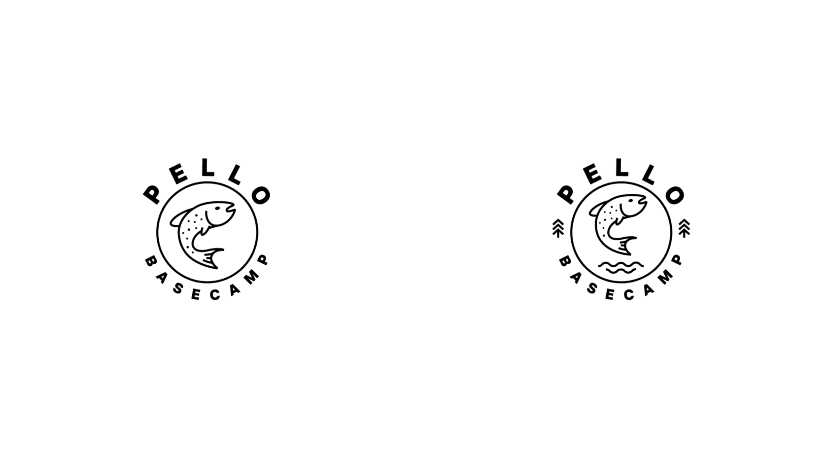
So, the final iteration started with enhancing the salmon fish element and the ideas considered in the previous revisions. The symbol had to become simpler to stay clear in various sizes and get done with a new color palette to connect with Hospitality and salmon fishing. And again, it started from basic sketching to thinking over the idea and moved to the polished logo.
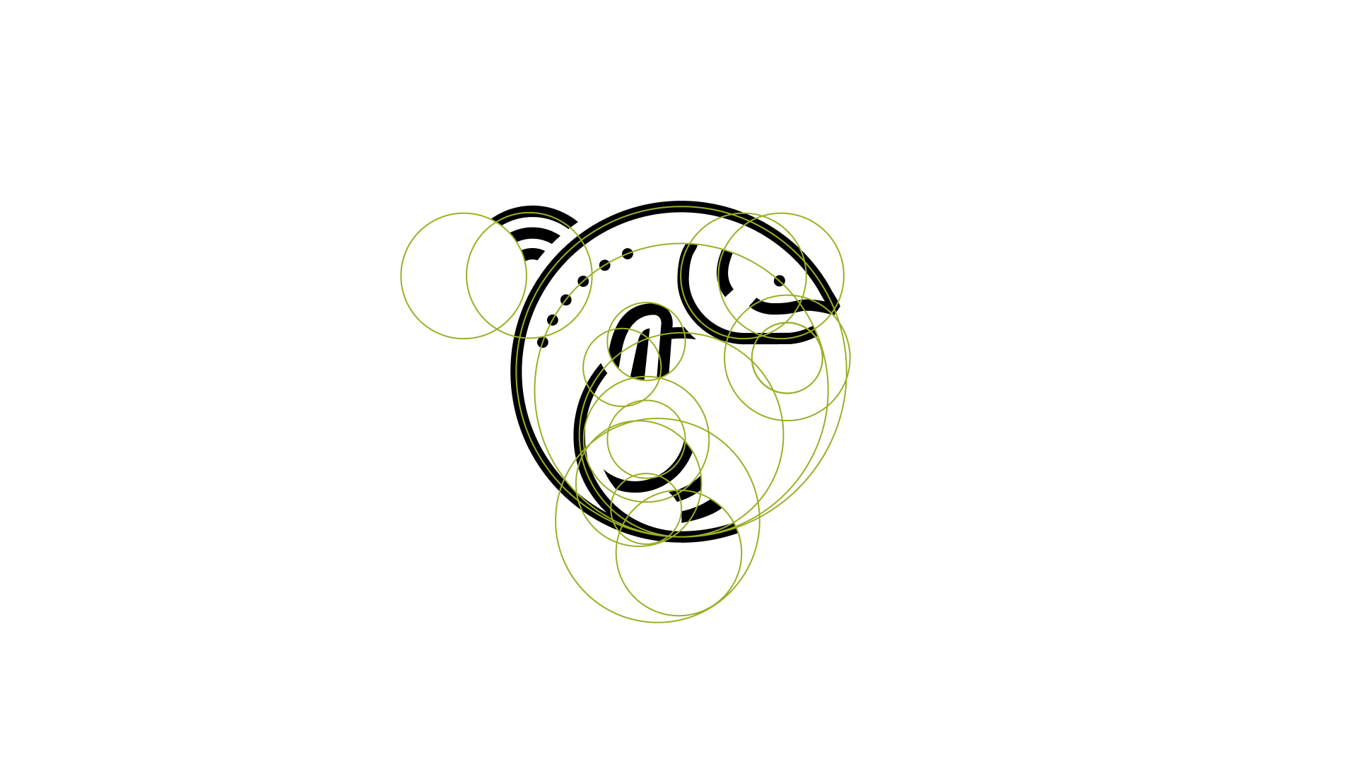
The creative process was done on the sign composition and details.
The idea resulted in a simpler symbol with a minimal level of detail and a bold, readable typographic part.
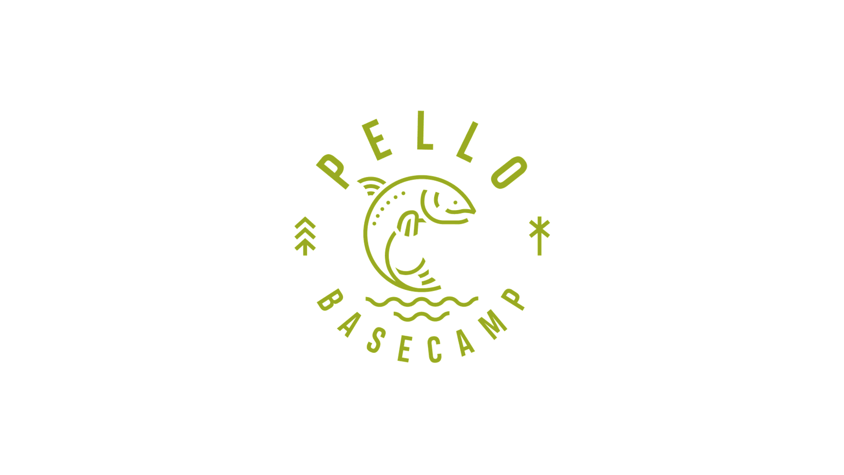
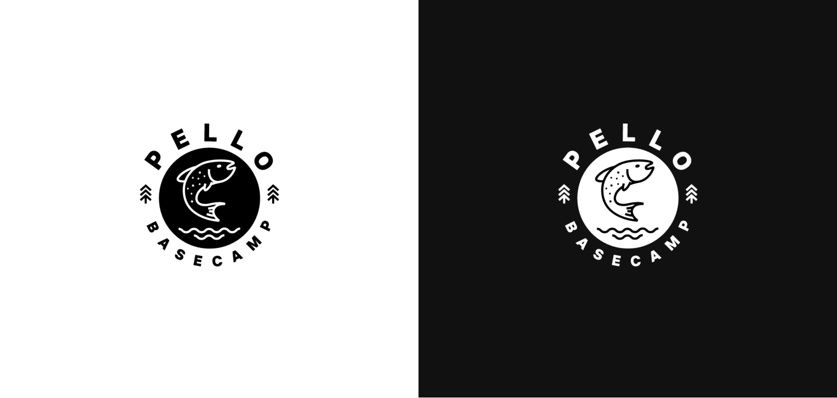
Finally, the circled option with strict thin lines and a light, elegant sans-serif typographic was chosen as an approved brand sign.
And here's how The team presented the design system for branded items.
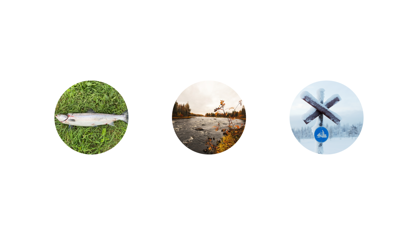
With the brand visuals above, it's also easy to see that creating custom icons was another essential aspect of identity design for Pello Basecamp.
Here's a closer glance at the creative color icons helping different text messages and making visible stimuli for fundamental functions or uses to create them more prominent and well-organized for website guests.
Web Design
The next stage of the customer experience design, boosting the efficiency of the service display and amplifying brand communication online, was designing a website. In the initial phase, the crew dwelled on creating a structure that would be practical and specific for the various target audience of the enterprise.
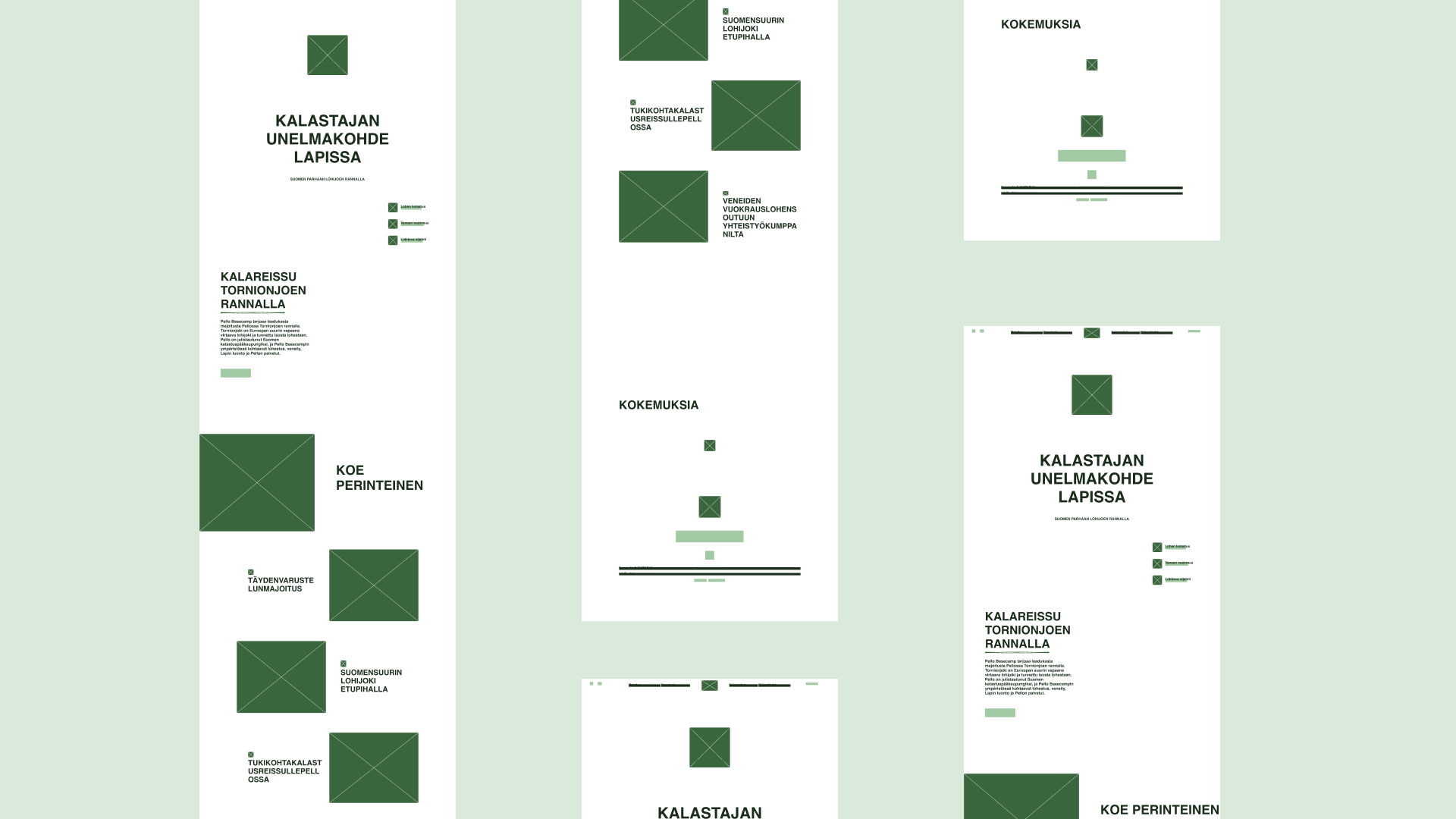
Overview of the UX phase to think of a functional and clear website layout and navigation
At the UI design stage, the bright brand colors were used as background shades for various website areas, keeping the website on brand, usable and readable.
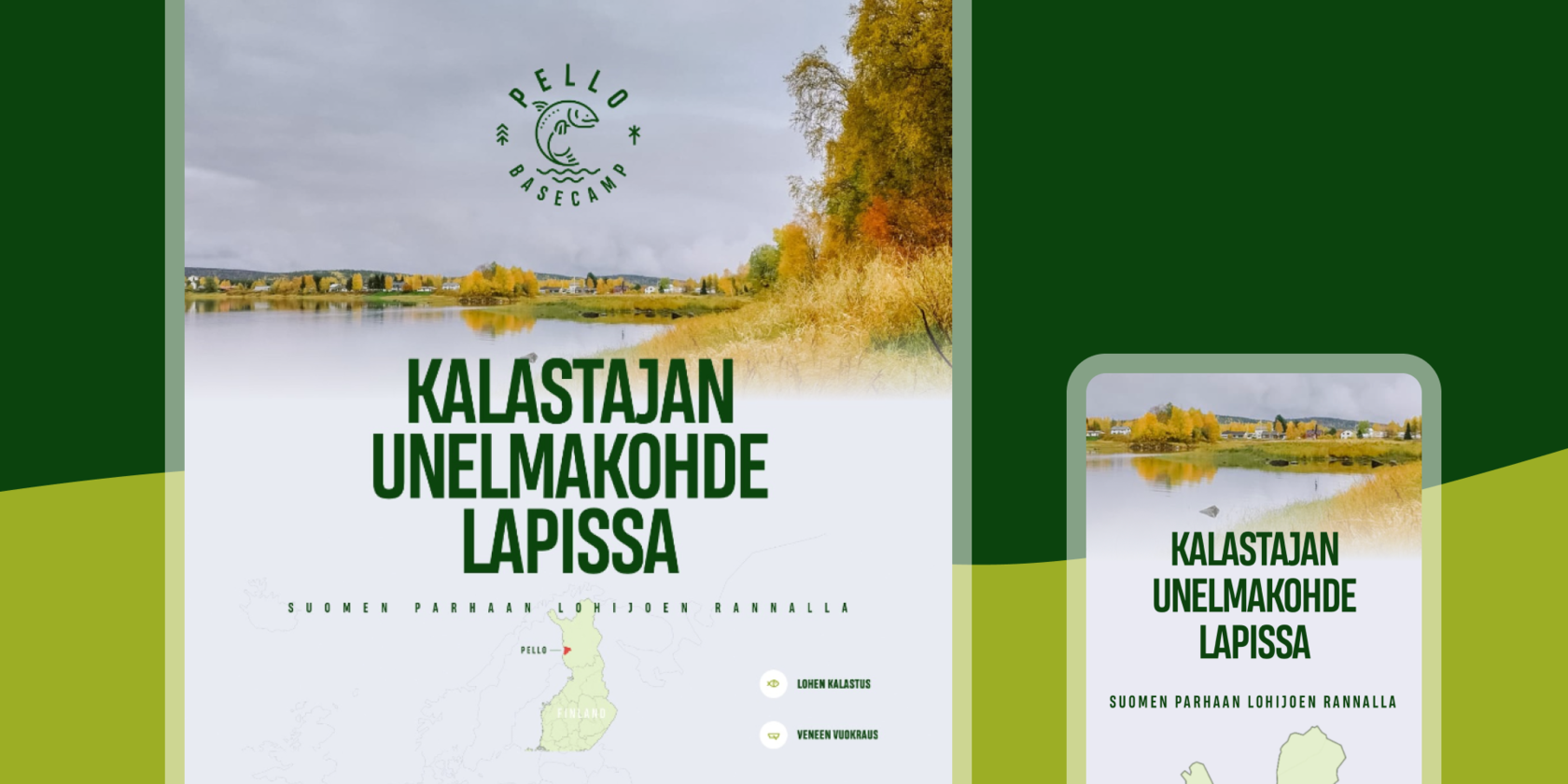
Here's a glance at the website's home page, catchy, friendly, and informative, amplifying the message with visuals sharing the positive atmosphere and giving instant connection to the topic of fishing.
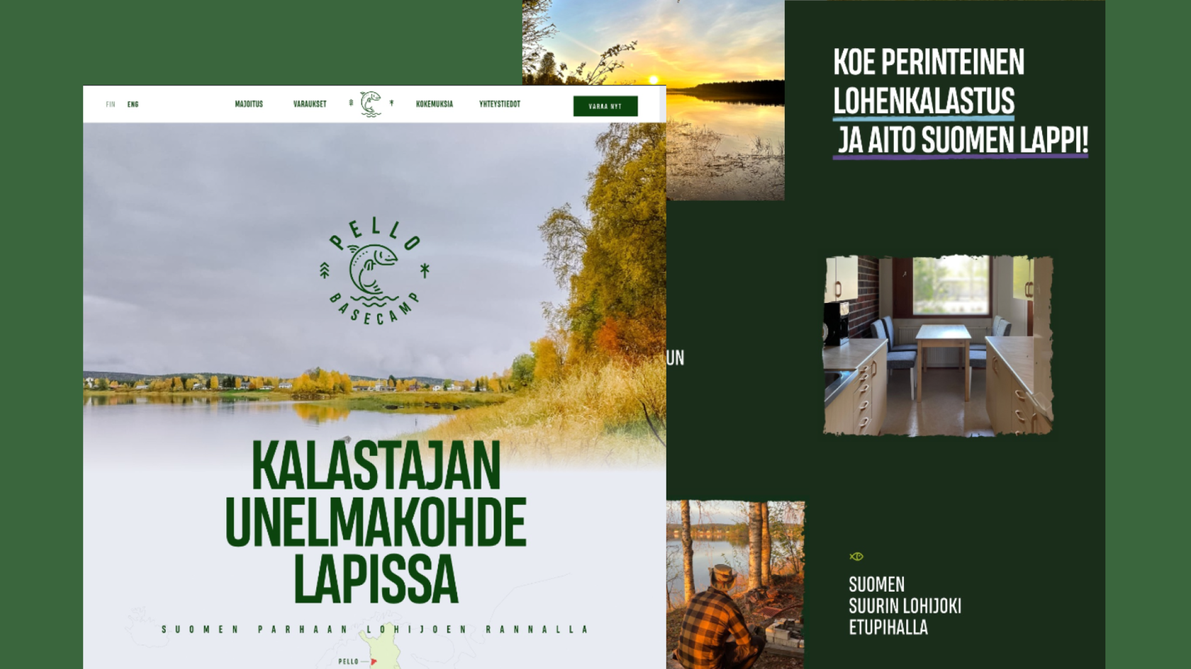
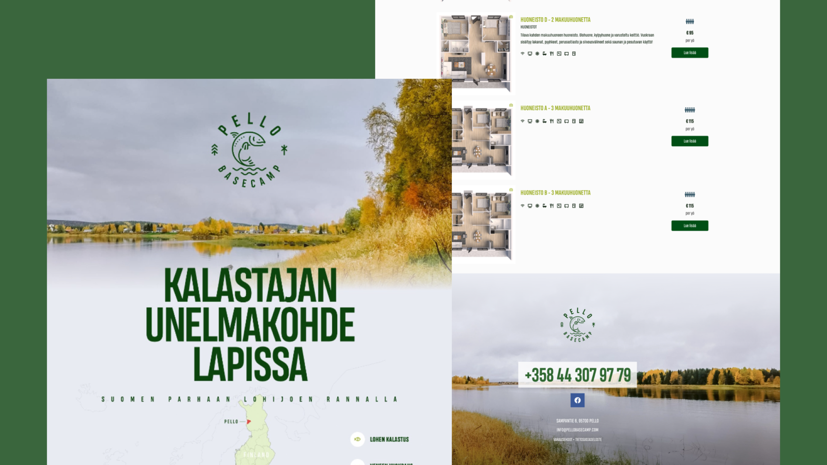
We also created custom illustrations to visualize the apartments.

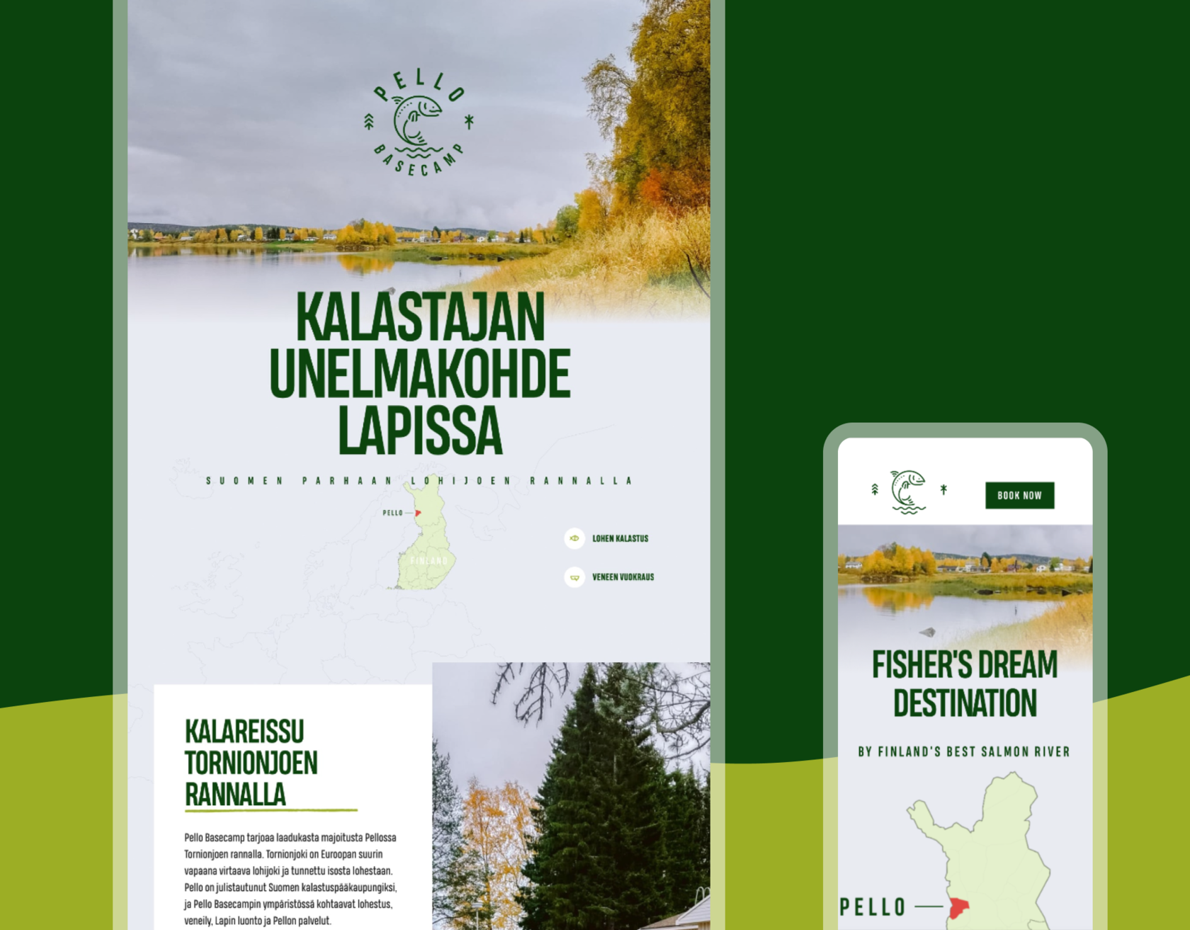
The mobile versions were also well-thought-out to make the website work effectively and look attractive on any device. Designers arranged them to provide a smooth and integral user experience at any stage of interaction.
For our team, the Pello Basecamp project was a great chance to collaborate with the representatives of the great companies providing helpful and enlightening services.
New design case studies from our crew are arriving shortly. Stay tuned!