
Our team is immersed in the universe of software industry decision-making. The Neison Nord website has been developed to make collaborating with this company easier. Neison Nord is a software programming, web, and application development company in Nordics.
Project
We developed a new brand identity, website design, and custom illustrations for Neison Nord company.
This project's creative team from our side included Igor Polyakov, Sajhib Hossein, and Susanna Talvi.
Client
The team at Neison Nord works with you to create a custom-made software solution to suit your business needs. They work with you to create a roadmap and timeline for the project and will adjust it if necessary. The team is dedicated to delivering high-quality software that meets your business needs. They are always open to feedback and suggestions, so you can be sure you are getting what you need. Neison Nord will always be there to support you and your team throughout the life of the project.
We operated on the trademark identity and website design for this company. Because the design system and website were designed to be accessible and affordable, we created a branding strategy that was simple and accessible. This approach helped them connect with their customers and explain the benefits of their products.
Identity Design
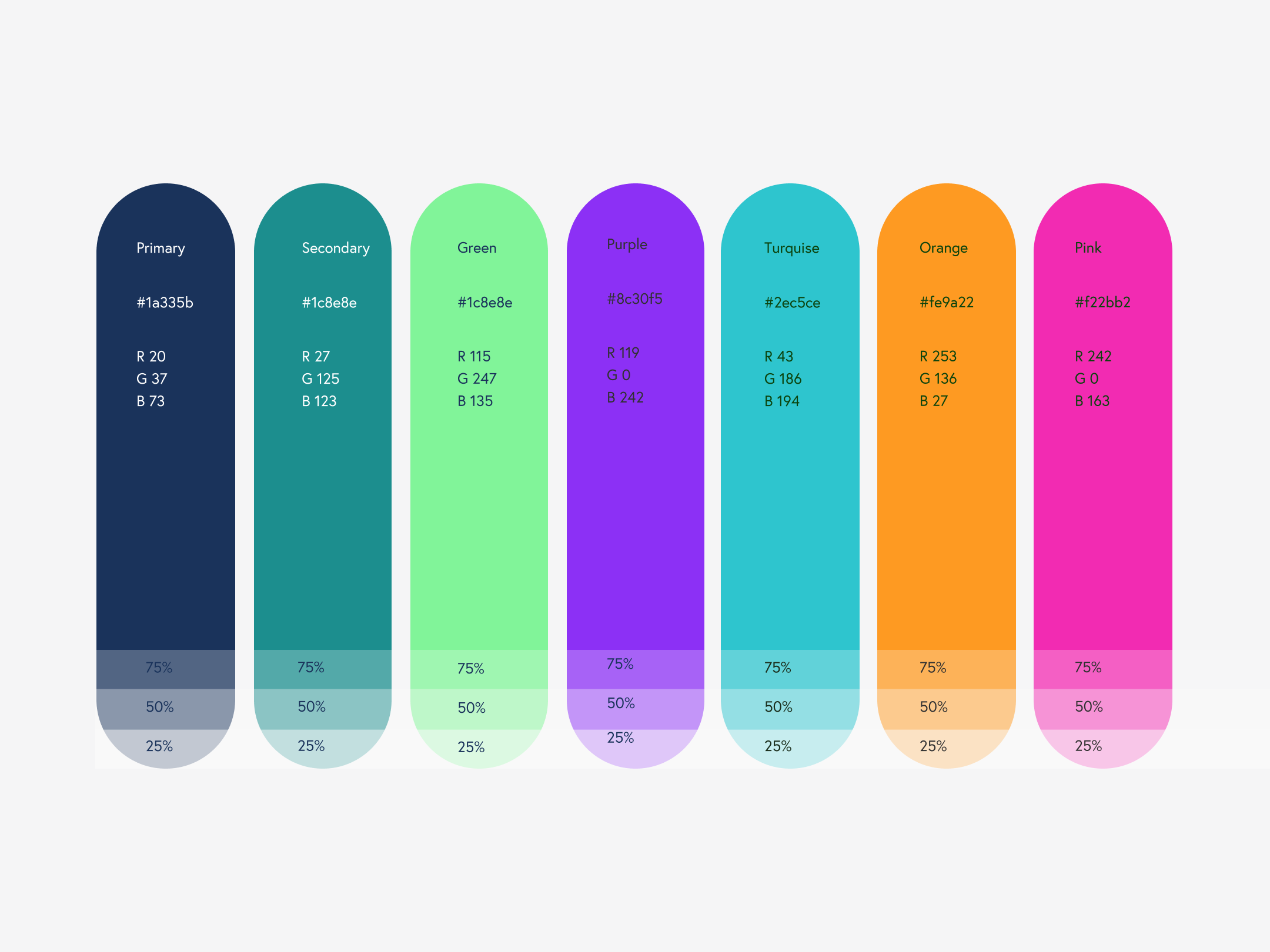
To begin with, we researched the software and development industries in the Nordics, the difficulties consumers faced, and where the company's message was being communicated. We emphasized the service's critical advantages, innovation, professionalism, and modernity. The team wanted to create a visual identity design method that could shift from more businesslike to more emotional. The software industry was connected by color psychology and the psychology of novelty, professionalism, and technology through color to create an instant visual connection. The bright and vibrant colors make a quick graphic link to the topic of originality, professionalism, and technology. The brand uses green, orange, and blue hues extensively.
The group began working on the logo after deciding on colors. The initial strategy approach was based on graph lines as a central symbol of the firm. Using creative investigation, we developed a batch of brand symbols that suggested that concept through linear illustrations of smooth lines and clear type.
Here's a look at the logo design approach, from sketches via revisions to the shiny symbol. This directive's first version of the emblem formed was an abstract symbol depicting the electric waves or a graphic chart.
First sketches to consider the idea and find the composition
Digital symbol development
The first idea for the symbol's visual metaphor was to use the two "N" letters as a graph, which was also seriously considered. Our designers demonstrated how the Client could utilize this symbol and color scheme for different marketing purposes by showing a set of branded products: business cards, posters, printed advertisements, and so on. As a result, the logo is simple, legible, and colorful. The Client's team, however, came to believe that the logo needed altering as they gained more knowledge of the Neison Nord brand's visual universe. It makes its message bright, contemporary, memorable, and versatile for various communication purposes.
Finally, the option with strict thin lines and a light, elegant sans-serif typographic was chosen as an approved brand sign.
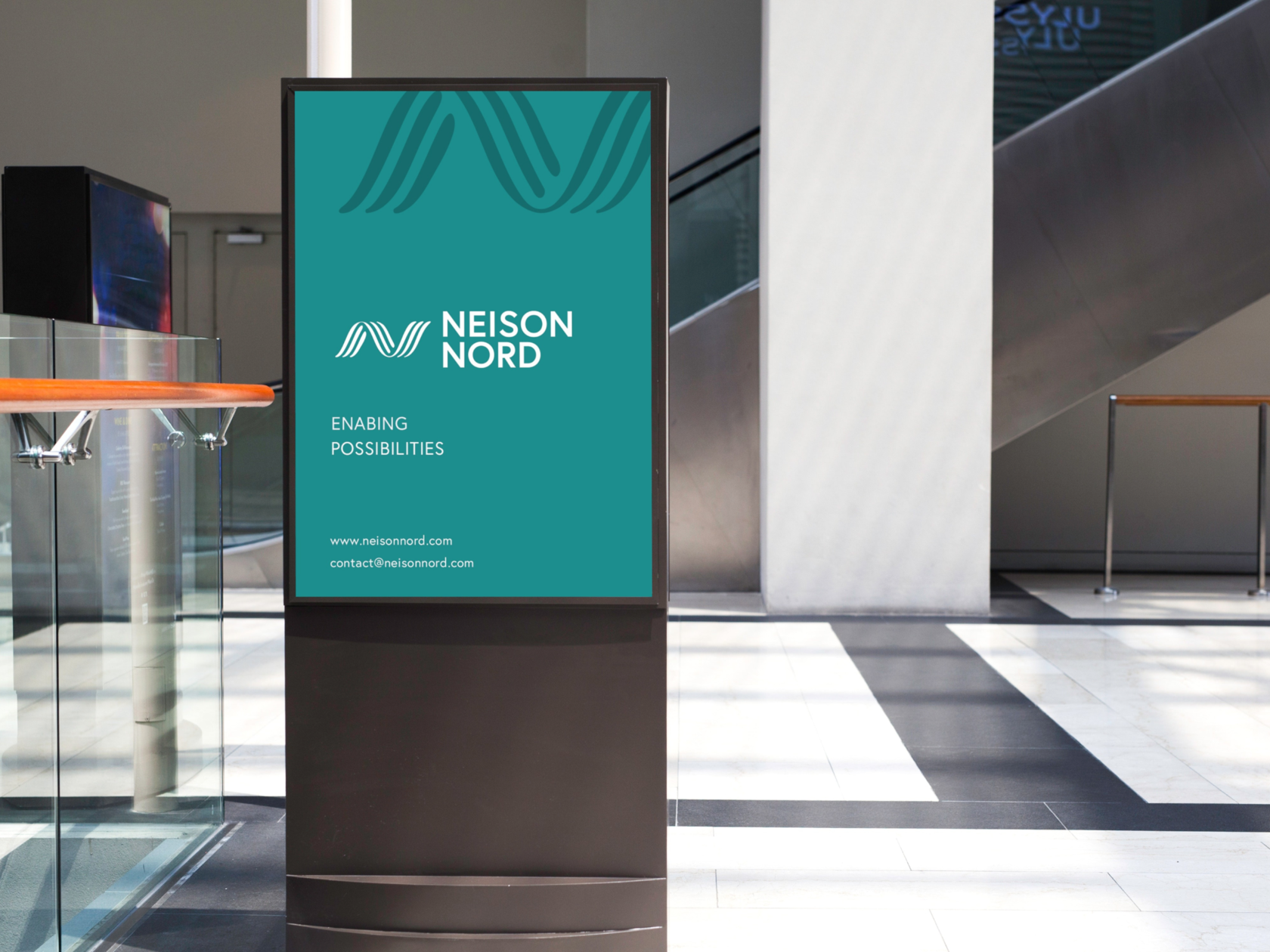
So, based on that take-out, the uniform collection of branded objects was designed for brand communication.
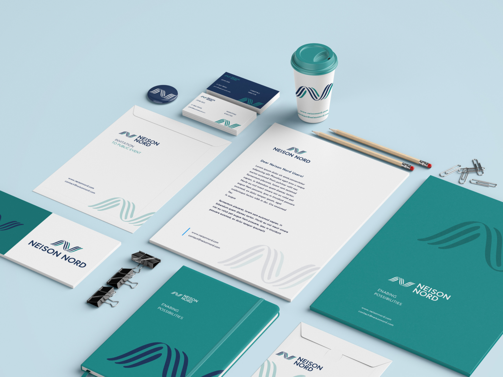
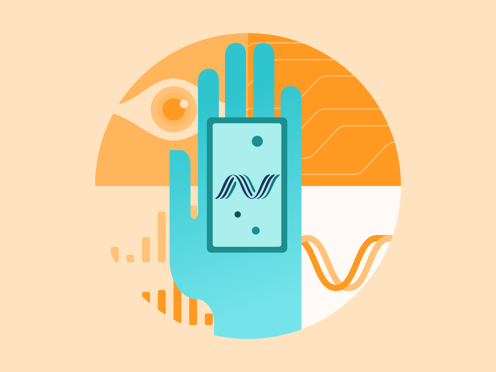
To reiterate is simple to see from the brand visuals that commissioning custom icons was an essential aspect of identity design for Neison Nord. Here, you can see the creative color icons helping to make visible stimuli for fundamental functions or uses more prominent and well-organized for website visitors.
Web Design
The following phase of customer experience design, boosting the effectiveness of the service display and communicating the brand online, was to construct a website. The team initially created a framework that would be practical and particular to the wide assortment of target customers. They then moved on to developing a website.
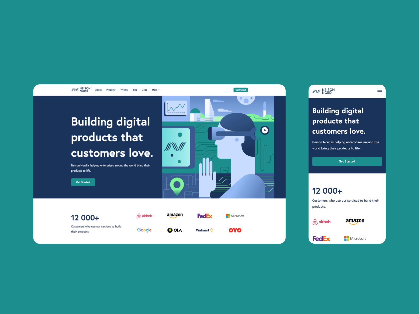
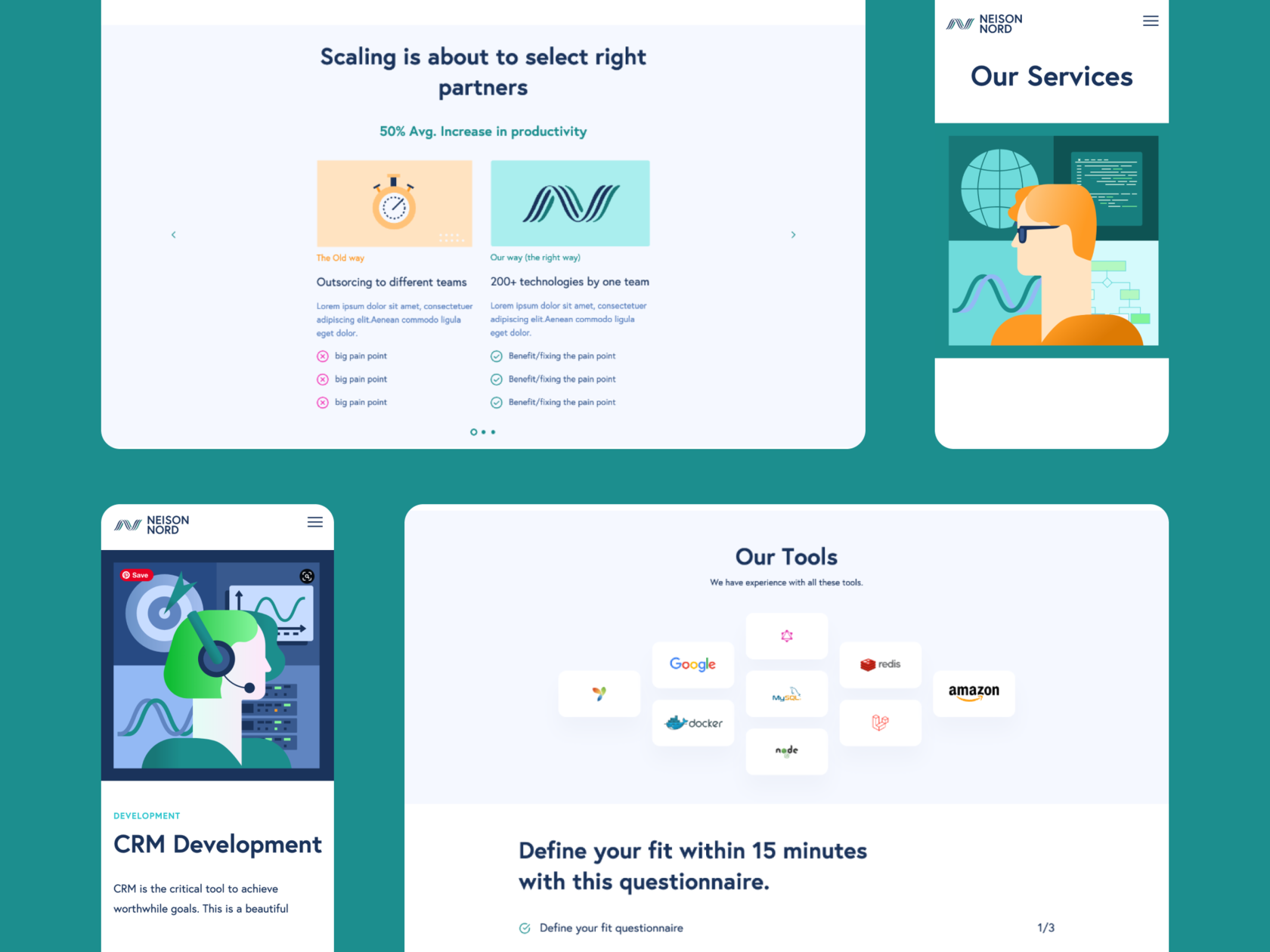
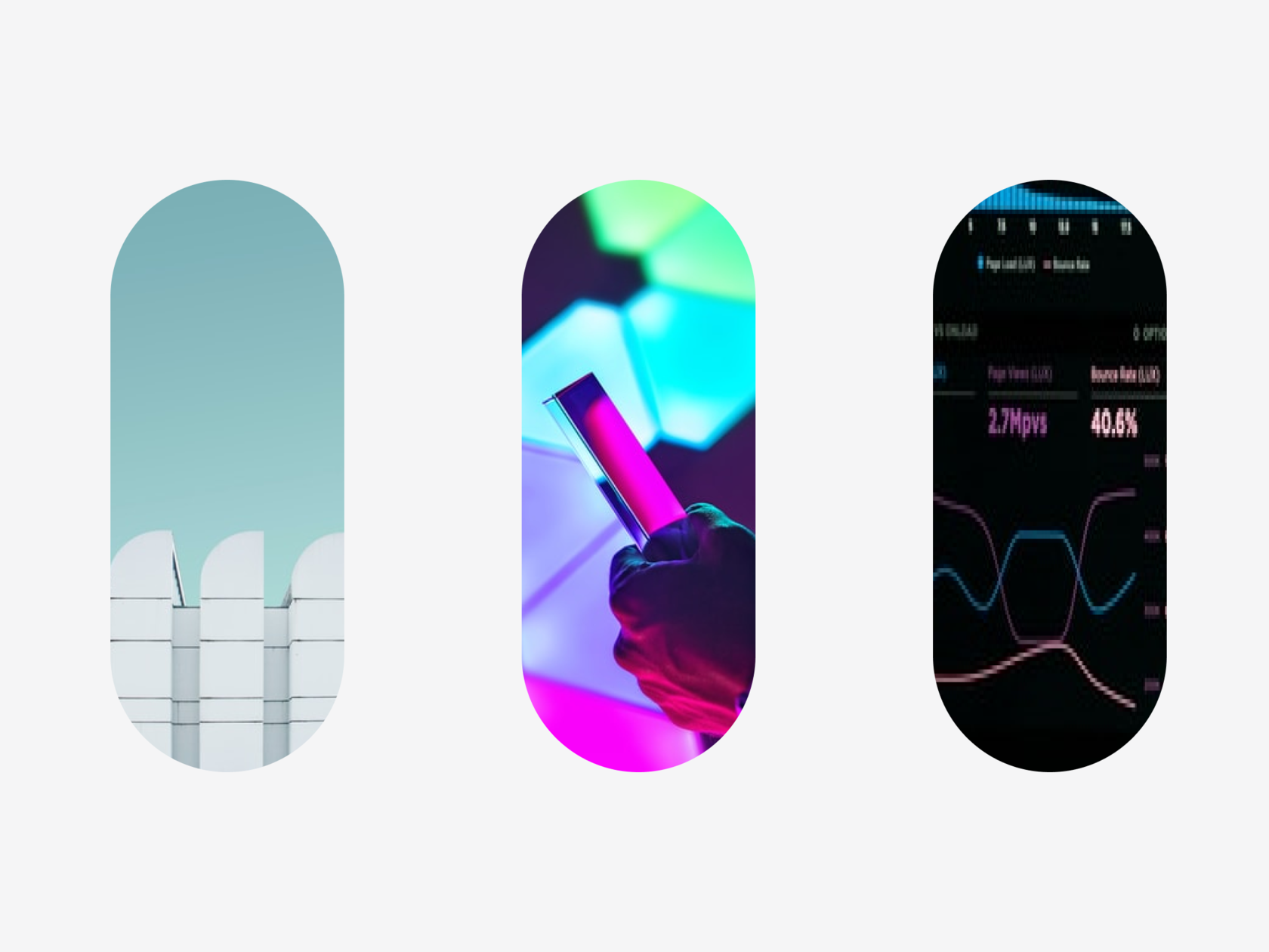
Also, We created custom illustrations to visualize how the technology works and make its benefits more accessible.


For our team, the Neison Nord project was a great chance to collaborate with the representatives of great companies providing helpful and enlightening services.
New design case studies from our crew are arriving shortly. Stay tuned!