What is responsiveness?
What is responsiveness?
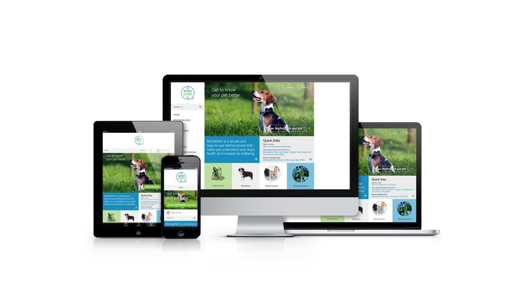
Responsive websites can change their original appearances and functions to fit and perform properly on all types of devices, whether it’s being opened on desktops, laptops, smartphones, or tablets. The goal of site responsiveness is to ensure that every website visitor accesses the same information and tools irrespective of their browsing devices.
Since over 60% of internet traffic now comes from mobile devices today, mobile internet usage has grown more than desktop users. This ever-increasing global mobile device usage compels businesses and companies to continuously increase the mobile presence of their websites to create a smooth surfing experience for mobile users.
Hotsnow’s Finland currently focuses on mobile-friendly and fully responsive website design and development for small, medium, and large businesses. We use flexible grids and media queries to achieve a fluid layout that easily changes content sizes and page elements depending on the browsing devices’ screens.
Your need for responsive websites
The first benefit of having a responsive website is the cost-saving that comes from building two sites to fit various types of browsing devices—mobiles and desktops.
Also, running a mobile-friendly website allows more mobile users to browse through and revisit your site.
Finally, a responsive website ranks more on search engine results directed by mobile devices. That in itself enhances your brand’s visibility to an online audience, as over 60% of online web surfing now emanates from mobile devices. Search engines also tend to favor more mobile-friendly websites, making it a must for any brand that wants to maximize the available traffic from search engines to websites. Non-mobile-friendly websites are no longer displayed on the first page of mobile search results like Google. Other search engines have included responsiveness as a significant step in search engine optimization.
Maximum responsiveness
Combining simplicity, minimalism, and usability, we based our sleek designs on the Scandinavian perspective. Research shows that using fewer designs produces an excellent navigation experience and site engagement of users. Our design method aims to reflect your business's image and leave an enduring imprint on on-site visitors.
We also provide continued consultation during the design process that helps you choose your desired layout, style, and structure for the website. We are experts at strategically placing content on pages for the best user experience. Also added to our services include structuring, content architecture, and ensuring the consistency of site content and your business goal. Since rich and useful content positively influences your business credibility, we raise your chance of being referenced by notable authorities and influencers in your domain.
Complete website re-design
While we help new businesses design brand-new responsive websites, we also help companies with existing websites convert their non-mobile-friendly websites into responsive sites. We can redesign and carry out a technical update on outdated websites alongside providing a professional consultation for website improvement. The degree of updates usually varies based on the individual needs of a client.
Prioritizing accessibility and usability
In the design of any website, we consider the need and preferences of a specific audience. We aimed at achieving user appeal and meeting the expectations of users. Hotsnow’s approach also focuses on providing ease of access and a user-friendly interface for every possible user without leaving those with disabilities.
Also, we never leave out the site speed, knowing its importance to mobile users. Thus, the contents of our websites are always fast to navigate and load.